- Home
- Introduction
- 1. Design rights
- 1.1. Design rights: overview
- 1.2. What a design right protects
- 1.3. Why protect a design?
- 1.4. How designs are protected in Australia?
- 2. Application for registration
- 2.1. Application for registration: overview
- 2.2. Registration process
- 2.3. Submitting an application
- 2.4. Minimum filing requirements
- 2.5. Who is entitled to be a registered owner?
- 2.6. Types of applications (s 22)
- 2.7. Request for registration
- 2.8. Further designs
- 3. Fees
- 3.1. Fees: overview
- 3.2. Application fees
- 3.3. Renewal fees
- 3.4. Examination fees
- 3.5. Hearing fees
- 3.6. Fees for extensions of time
- 3.7. Refunds
- Production test Designs
- 4. Formalities assessment
- 4.1. Formalities assessment: overview
- 4.2. The ‘Formalities check’ and ‘Formal requirements’
- 4.3. Formalities notices
- 5. Applicant details
- 5.1. Applicant name: overview
- 5.1.1. Is the applicant a person?
- 5.1.2. Individual (Australian and overseas, including joint owners)
- 5.1.3. Australian company (Pty Ltd, Ltd)
- 5.1.4. Strata company, owners corporation, body corporate etc
- 5.1.5. Government entity
- 5.1.6. Incorporated association
- 5.1.7. Overseas entity (AG, S.r.L etc)
- 5.1.8. Several applicant names, multiple designs
- 5.1.9. Joint owner names with ABN
- 5.1.10. Partnership
- 5.1.11. Trust/trustee
- 5.1.12. Business names and 'trading as'
- 5.1.13. Applicant name and design owner
- 5.2. Applicant address
- 6. Representations
- 6.1. Representations: overview
- 6.2. General requirements
- 6.3. Formal compliance
- 6.4. Product
- 6.5. Consistency
- 6.6. Text
- 6.7. Common designs
- 6.8. Drawings
- 6.9. Photographs
- 6.10. Specimens or 3D models
- 6.11. Different views
- 6.12. Environmental views
- 6.13 Pairs and mirror images
- 7. Classification
- 7.1. Classification: overview
- 7.2. Classification systems
- 7.3. Finding the right class
- 7.4. Cases of doubt
- 7.5. More than one possible classification
- 7.6. Multiple products or designs
- 8. Examination and certification
- 8.1. Examination and certification: overview
- 8.2. Examination and certification processes
- 8.3. Requesting examination
- 8.4. Third party initiated examinations
- 8.5. Concurrent requests for examination
- 8.6. Expedited examination
- 8.7. Material provided by a third party
- 8.8. Relevant material that must be considered
- 8.9. Time frame for completion of examination and last-minute responses
- 8.10. Withdrawal of request for examination
- 8.11. Notice of intention to certify
- 8.12. Requests for examination after certification
- 8.13. Further examination reports
- 8.14. Revocation
- 8.15. Examination hearings
- 8.16. Examination on Registrar's initiative
- 9. Identifying the design
- 9.1. Identifying the design: overview
- 9.2. Overall appearance
- 9.3. Visual features
- 9.4. Variable visual features
- 9.5. What cannot be a visual feature
- 10. Product
- 10.1. Product: overview
- 10.2. Identifying the product
- 10.3. Things that are not products
- 10.4. Things that are not different products
- 10.5. Product name
- 10.6. Manufactured or handmade
- 10.7. Component part of a complex product
- 10.8. Assembled set or kit
- 10.9. Indefinite dimensions
- 10.10. Examples - things that are / are not products
- 11. Excluded designs
- 11.1. Excluded designs: overview
- 11.2. Priority date of excluded designs
- 11.3. Extensions of time
- 11.4. Amendments
- 11.5. Registration/publication requests
- 12. Section 43 refusal to register
- 12.1. Section 43 refusal to register: overview
- 12.2. Medals
- 12.3. Anzac
- 12.4. Currency
- 12.5. Scandalous content
- 12.6. Arms, flags, emblems etc.
- 12.7. Olympic symbols
- 12.8. Integrated circuits
- 13. Assessing newness and distinctiveness
- 13.1. Assessing newness and distinctiveness: overview
- 13.2. Product name and intended use
- 13.3. Identifying the product
- 13.4. Test for newness
- 13.5. Test for distinctiveness
- 13.6. Substantially similar in overall impression
- 13.7. How the design is displayed
- 13.8. Other visual features
- 13.9. Searching
- 14. Section 19 requirements for distinctiveness
- 14.1. Section 19 requirements for distinctiveness: overview
- 14.2. Similarities and differences
- 14.3. State of development of the prior art base
- 14.4. Statement of newness and distinctiveness
- 14.5. Amount, quality and importance
- 14.6. Freedom of the creator of the design to innovate
- 14.7. Familiar person / Informed user
- 15. Statement of newness and distinctiveness
- 15.1. Statement of newness and distinctiveness: overview
- 15.2. Formalities assessment of the SoND
- 15.3. Amendments to the SoND
- 15.4. Using the SoND to assess distinctiveness
- 16. Standard of the familiar person / informed user
- 16.1. Standard of the familiar person / informed user: overview
- 16.2. Identifying the familiar person / informed user
- 16.3. Declarations about the familiar person / informed user
- 16.4. Familiarity with the product
- 16.5. References to European and UK decisions
- 16.6. Familiar person’s / informed user’s knowledge base versus prior art base
- 17. Prior art base
- 17.1. Prior art base: overview
- 17.2 Publicly used in Australia
- 17.3. Published in a document within or outside of Australia
- 17.4. Trade marks and patents as citations
- 17.5. Establishing the publication date
- 17.6. Designs disclosed in applications
- 18. Prior publication or use exceptions
- 18.1. Prior publication or use exceptions: overview
- 18.2. Exhibitions
- 18.3. Unauthorised disclosures
- 18.4. Disclosure to government
- 18.5. Copyright
- 18.6. Grace Period
- Annex A - An example of a grace period declaration
- 19. Priority date
- 19.1. Priority date: overview
- 19.2. Convention application
- 19.3. Multiple bases for priority
- 19.4. Plural designs
- 19.5. When priority must be asserted
- 19.6. Excluded designs
- 19.7. Converted applications
- 19.8. Applications by an entitled person
- 20. Convention priority
- 20.1. Convention priority: overview
- 20.2. Convention countries
- 20.3. Time limit to claim convention priority
- 20.4. Assessing convention priority claims
- 20.5. Convention priority for excluded designs and applications that include more than one design
- 20.6. Basic application
- 20.7. Requesting the basic application
- 20.8. Relevance of the basic application to examination
- 21. Satisfied
- 21.1. Satisfied: overview
- 21.2. Meaning of ‘satisfied’
- 21.3. ‘Satisfied’ as to prior art base
- 21.4. Reasonable doubt, balance of probabilities and uncertainty
- 21.5. ‘Not satisfied’
- 22. Amendments
- 22.1. Amendments: overview
- 22.2. Amending an application
- 22.3. Amending a registration
- 22.4. Inclusion of matter not in substance disclosed
- 22.5. Increasing the scope of the design registration
- 22.6. Other types of amendments
- 23. Extensions of time
- 23.1. Extensions of time: overview
- 23.2. Legal principles
- 23.3. Error or omission by the Registrar
- 23.4. Error or omission by the customer
- 23.5. Circumstances beyond the customer’s control
- 23.6. Registrar’s discretion
- 23.7. Protection for third parties
- 23.8. Period of extension
- 23.9. Extensions process
- 23.10. Advertisement
- 23.11. Request from an unrecorded new owner
- 23.12. Extension of the convention priority period
- 24. Assignments (and other interests)
- 24.1. Assignments and other interests: overview
- 24.2. Recording changes of ownership
- 24.3. Possible complications
- 24.4. Bankruptcy and winding up
- 24.5. Registering other interests
- 25. Ownership disputes
- 25.1. Ownership disputes: overview
- 25.2. Disputes between joint applicants
- 25.3. Disputes where a non-applicant claims ownership
- 25.4. Disputes where some designs have been registered or published
- 25.5. Disputes about recording a change of ownership before registration
- 25.6. Typical situations where ownership disputes arise
- 25.7. Revocation after an ownership dispute
- 26. Production of documents under s 61(1)
- 26.1. Production of documents under s 61(1): overview
- 26.2. Powers of the courts
- 26.3. Powers of the Registrar
- 26.4. Precedent
- 26.5. Who access is granted to
- 26.6. Access in ownership disputes
- 26.7. Where inspection can take place
- 26.8. Right of lien
- 26.9. Draft undertaking for access
- 27. Publication and file access
- 27.1. Publication and file access: overview
- 27.2. Designs not publicly available
- 27.3. Legal exceptions
- 27.4. Freedom of information
- 27.5. Prohibition orders
- 28. Hearings
- 28.1. Hearings: overview
- 28.2. Filing evidence
- 28.3. Disputes over whether the design was new and distinctive at the priority date
- 28.4. Interface with court proceedings
- 29. Glossary
- 30. Citation index
- 31. Keyword index
- 32. Classification listings
- Class Heading Summary
- Class 01 Foodstuffs
- Class 02 Articles of clothing and haberdashery
- Class 03 Travel goods, cases, parasols and personal belongings not elsewhere specified
- Class 04 Brushware
- Class 05 Textile piecegoods, artificial and natural sheet material
- Class 06 Furnishing
- Class 07 Household goods not elsewhere specified
- Class 08 Tools and hardware
- Class 09 Packages and containers for the transport or handling of goods
- Class 10 Clocks and watches and other measuring instruments, checking and signalling instruments
- Class 11 Articles of adornment
- Class 12 Means of transport or hoisting
- Class 13 Equipment for production, distribution or transformation of energy
- Class 14 Recording, communication or information retrieval equipment
- Class 15 Machines not elsewhere specified
- Class 16 Photographic, cameras, cinematographic and optical apparatus
- Class 17 Musical instruments
- Class 18 Printing and office machinery
- Class 19 Stationery and office equipment, artists and teaching materials
- Class 20 Sales and advertising equipment, signs
- Class 21 Games, toys, tents and sporting goods
- Class 22 Arms, pyrotechnic articles, articles for hunting, fishing and pest killing
- Class 23 Fluid distribution equipment, sanitary, heating, ventilation and air conditioning equipment, solid fuel
- Class 24 Medical and laboratory equipment
- Class 25 Building units and construction elements
- Class 26 Lighting apparatus
- Class 27 Tobacco and smokers supplies
- Class 28 Pharmaceutical and cosmetic products, toilet articles and apparatus
- Class 29 Devices and equipment against fire hazards, for accident prevention and rescue
- Class 30 Articles for the care and handling of animals
- Class 31 Machines and appliances for preparing food or drink, not elsewhere specified
- Class 32 Graphic symbols and logos, surface patterns, ornamentation
- 33. Designs (Formal Requirements for Designs Documents) Instrument 2022
6.8. Representations: Drawings
General requirements
Drawings of a design should:
- show the whole, assembled product
- accurately show the overall visual features of the product design
- be accurately drawn (i.e. not sketches) with well-defined lines.
Drawing techniques
Shading
Colour, shading or cross-hatching are sometimes used to highlight the visual features of the design. Conversely, they can be used instead to indicate parts of the product that are not visual features of the design.
Shading (or cross-hatching) should not be so dark that it makes important details of the design hard to see.
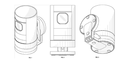
If a representation includes shading, all of the views should show the same type/degree of shading. The principle that one representation cannot show anything that is not indicated or implied in the others also applies to shading.
Example (Design 201813984)
Product name: Security camera
Representations:

This example shows acceptable, consistent use of shading.
Linework
It is acceptable for representations to use a combination of solid lines and broken (dashed or dotted) lines which helps to identify the product’s new and distinctive features.
Broken lines often indicate things like:
- generic features of the product (i.e. not the new and distinctive visual features of the design)
- boundaries (e.g. of a pattern on part of a surface)
- stitching
- perforations
- hidden elements (typically in perspective views)
- features that establish an environmental context – e.g. a store dummy (not part of the design) dressed in an item of clothing (the designed product).
Generally we assume that:
- solid lines highlight new and distinctive features
- broken lines show parts of the product that do not have new and distinctive features.
We do not completely ignore the parts with broken lines – it is just that we consider that the parts with solid lines are probably the main focus of the design being applied for.
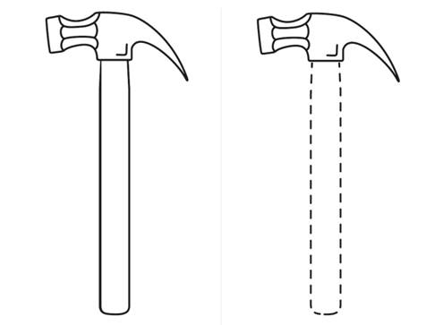
Also, we assume that differences in line style are for a purpose. This means that if one drawing of the product uses solid lines and another uses broken lines, we will consider that they show different designs (and therefore will issue a formalities notice). An exception to this is with an environmental view.
Example
Product name: Hammer
Representations:

In this example the 2 representations are identical except for line style. The drawing on the left implies that the whole product is equally new and distinctive, it is all in solid lines. The drawing on the right implies that the features drawn in solid lines are new and distinctive and the parts in dashed lines are less important. Because of this, we would consider them to show 2 different designs.
Colour
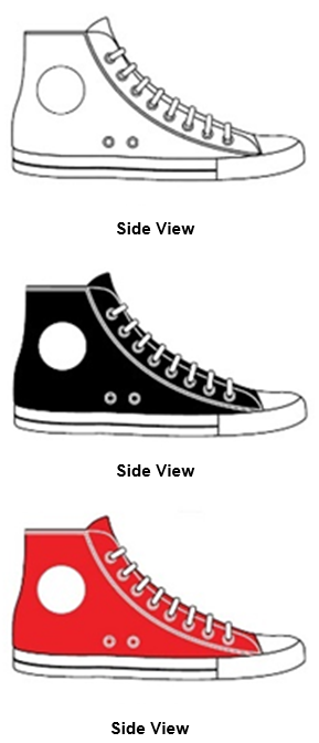
The colour of a product can be an important distinguishing feature. Two products that are exactly the same except for the colour have a different visual appearance. As in the following example, we would see them as different designs.
The set of design representations shown in the below example, all filed in one application, is inconsistent in terms of colour.
Example
Product name: Shoe
Representations:


Amended Reasons
| Amended Reason | Date Amended |
|---|---|
Formal Requirements Instrument changes |
